Long description: Ch25interpJPW
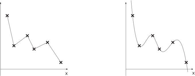
Alt text: The image shows two graphs: the left one connects data points with straight lines, and the right one connects the same data points with a smooth, curved line.
This description was generated by AI and has not been verified by a human. If you spot an error, please use the feedback link below.
- The image displays two separate graphs plotted against a horizontal axis labeled "x" and a vertical axis with no label visible.
- The graph on the left represents a connection between discrete data points using straight line segments, creating sharp corners at each data point, illustrating linear interpolation.
- The graph on the right displays the same set of data points, but the points are connected by a continuous, smooth curve, which suggests a more sophisticated interpolation method than simple straight lines.