Long description: multi
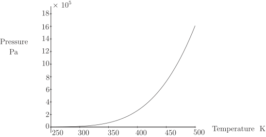
Alt text: A graph showing pressure, in units of pascals, increasing nonlinearly as temperature increases from 250 kelvins to 500 kelvins.
This description was generated by AI and has not been verified by a human. If you spot an error, please use the feedback link below.
- The graph plots Pressure on the vertical axis, ranging from 0 to 18 times ten to the fifth pascals, and Temperature on the horizontal axis, ranging from 250 to 500 kelvins.
- A single curve is drawn, illustrating the relationship between pressure and temperature.
- The curve starts near the origin, at approximately 1 time ten to the fifth pascals when the temperature is 250 kelvins.
- As the temperature increases, the pressure increases at an accelerating rate, indicating a convex relationship.
- By the time the temperature reaches 500 kelvins, the pressure has risen sharply to a value close to 16 times ten to the fifth pascals.