Long description: Block221_Fig5
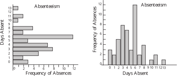
Alt text: The image displays two histograms illustrating the frequency distribution of absenteeism in terms of days absent.
This description was generated by AI and has not been verified by a human. If you spot an error, please use the feedback link below.
- The image contains two separate bar charts, both titled "Absenteeism."
- The chart on the left uses a horizontal bar graph format, with "Days Absent" listed on the vertical axis ranging from 0 to 13, and "Frequency of Absences" on the horizontal axis ranging from 0 to 12.
- The chart on the right uses a vertical bar graph format, with "Days Absent" on the horizontal axis ranging from 0 to 13, and "Frequency of Absences" on the vertical axis ranging from 0 to 12.
- Both histograms show variations in the frequency of absences across different number of days absent, with the distribution shape differing between the two visualizations.