Long description: Block221_Fig11
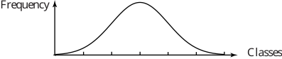
Alt text: The image displays a smooth, symmetrical bell curve graph showing the relationship between frequency on the vertical axis and classes on the horizontal axis.
This description was generated by AI and has not been verified by a human. If you spot an error, please use the feedback link below.
- The graph features a horizontal axis labeled "Classes" and a vertical axis labeled "Frequency".
- A single, continuous curve is plotted, forming a characteristic bell shape.
- The curve starts at a low frequency value on the left side (representing lower class values).
- It rises smoothly to a peak, reaching the maximum frequency near the center of the horizontal axis.
- After the peak, the curve descends symmetrically, approaching zero frequency as the values on the horizontal axis increase to the right.