Long description: Block221_Fig14
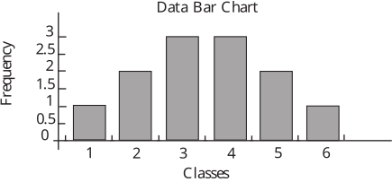
Alt text: A bar chart titled "Data Bar Chart" shows the frequency distribution across six classes, with the highest frequencies occurring in classes three and four.
This description was generated by AI and has not been verified by a human. If you spot an error, please use the feedback link below.
- The chart displays the relationship between "Classes" on the horizontal axis and "Frequency" on the vertical axis.
- The bar for class one has a frequency of approximately 1.0.
- The bar for class two has a frequency of approximately 1.8.
- The bar for class three reaches the highest frequency, approximately 2.8.
- The bar for class four also shows a high frequency, nearly matching class three at approximately 2.8.
- The bar for class five has a frequency of approximately 1.7.
- The bar for class six has the lowest frequency shown, at approximately 0.9.