Long description: Block221_Fig17
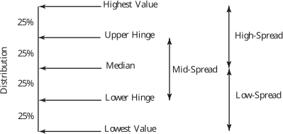
Alt text: A diagram comparing two concepts, 'Hinge' and 'Spread', using arrows to indicate relative positions along a vertical distribution axis.
This description was generated by AI and has not been verified by a human. If you spot an error, please use the feedback link below.
- The diagram is divided into two vertical sections, comparing two measures: one labeled with points related to 'Hinge' and the other with points related to 'Spread'.
- The vertical axis, labeled 'Distribution', is marked with intervals representing values from the bottom to the top, with markers at the levels of 'Lowest Value', 'Lower-Hinge', 'Median', 'Upper-Hinge', and 'Highest Value' on the left side.
- The right side, corresponding to 'Spread', shows levels labeled 'Low-Spread', 'Mid-Spread', and 'High-Spread', with corresponding lines indicating these levels.
- On the left side, a series of horizontal double-headed arrows span the vertical space, illustrating the distance between defined points, such as 'Lowest Value' to 'Highest Value', and also marking levels labeled 'Lower-Hinge', 'Median', and 'Upper-Hinge'.
- On the right side, a vertical double-headed arrow is drawn, spanning the space between 'Low-Spread' and 'High-Spread', encompassing the 'Mid-Spread' level.