Long description: Block221_Fig20
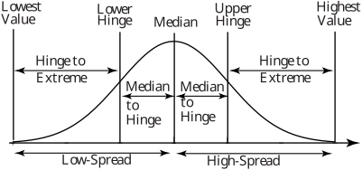
Alt text: A diagram illustrating the spread of data points using 'hinges' and 'extremes' across a range from lowest to highest value.
This description was generated by AI and has not been verified by a human. If you spot an error, please use the feedback link below.
- The horizontal axis represents a range from 'Lowest Value' to 'Highest Value,' labeled with segments such as 'Low-Spread' and 'High-Spread'.
- The vertical axis represents the frequency or density of data, forming a symmetrical, bell-shaped curve (a normal distribution).
- The curve is segmented by vertical lines indicating specific points: 'Lowest Hinge,' 'Median,' 'Upper Hinge,' and 'Highest Value.'
- The distance labeled 'Hinge to Extreme' spans from 'Lowest Hinge' to the point marked 'Low-Spread' on the left, and from 'Upper Hinge' to the point marked 'High-Spread' on the right.
- A central segment is marked 'Median to Hinge,' which represents the distance from the central 'Median' point to the 'Lower Hinge' and the distance from the central 'Median' point to the 'Upper Hinge.'
- The diagram visually implies that the spread of the data can be analyzed relative to specific quantiles, such as the median and various hinges.