Long description: Block221_Fig26
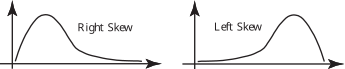
Alt text: The image displays two bell-curve-like graphs, one labeled "Right Skew" and the other labeled "Left Skew," illustrating different distributions.
This description was generated by AI and has not been verified by a human. If you spot an error, please use the feedback link below.
- The image contains two separate graphs, each depicting a probability distribution curve along a horizontal axis and a vertical axis.
- The graph on the left is labeled "Right Skew" and shows a curve that rises to a peak in the left portion of the graph and then descends gradually towards the right.
- The graph on the right is labeled "Left Skew" and shows a curve that rises gradually from the left, reaches its peak in the right portion of the graph, and then descends sharply towards the right.
- Both graphs are drawn in a style resembling normal distribution curves.