Long description: workbook23Fig8
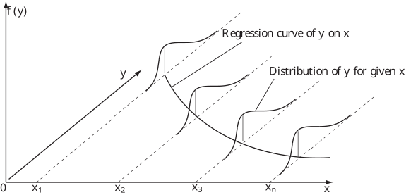
Alt text: A graph illustrating the relationship between a variable y and a variable x, showing a regression curve and associated probability distributions.
This description was generated by AI and has not been verified by a human. If you spot an error, please use the feedback link below.
- The image displays a two-dimensional graph with the vertical axis labeled \(f(y)\) and the horizontal axis labeled \(x\), with tick marks at \(0\) and \(x_n\) labeled \(x\).
- A solid, downward-curving line represents the "Regression curve of y on x".
- There are several vertical dashed lines drawn from the curve, marking points corresponding to \(x_2\), \(x_3\), and \(x_n\).
- Associated with these points are shaded areas or curves, labeled "Distribution of y given x," illustrating the conditional probability distribution of \(y\) given a specific value of \(x\) at those points.
- Additionally, there is a solid line drawn from the origin to a point labeled \(y\), representing the general relationship or the overall mean trend.