Long description: qcfig2
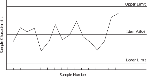
Alt text: A control chart showing sample data points plotted against upper, ideal, and lower control limits.
This description was generated by AI and has not been verified by a human. If you spot an error, please use the feedback link below.
- The chart displays a time series plot labeled "Sample Characteristic" on the vertical axis and "Sample Number" on the horizontal axis.
- Three horizontal lines are drawn to represent control limits: an upper limit, an ideal value (center line), and a lower limit.
- Data points fluctuate over the sample numbers, indicating the observed value for each sample relative to the established limits.
- The general pattern of the plotted points suggests variability around the ideal value, with some points approaching or touching the control limits.