Long description: qcfig7
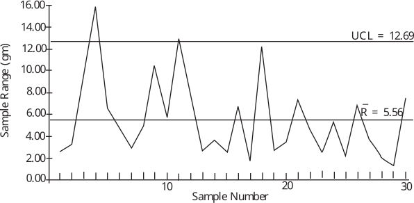
Alt text: A control chart showing sample range measurements over time, with upper and center lines indicating process limits.
This description was generated by AI and has not been verified by a human. If you spot an error, please use the feedback link below.
- The chart is a control chart tracking 'Sample Range' in grams on the vertical axis against 'Sample Number' on the horizontal axis, which ranges from approximately 1 to 30.
- Two horizontal lines are labeled as control limits: the upper control limit (UCL) is set at \(12.69\) grams, and the center line (mean, \(\bar{R}\)) is set at \(5.56\) grams.
- The data points representing the sample range fluctuate considerably across the plotted samples.
- At sample number 1, the range is near \(2.5\) grams.
- The range increases significantly to a peak near \(15\) grams around sample number 3.
- Following this peak, the range drops to around \(4\) grams by sample number 7.
- Subsequent measurements show a generally fluctuating pattern, reaching a local high near \(10\) grams around sample number 10.
- The range decreases again, staying below \(4\) grams through samples 14 to 18.
- There is another noticeable peak reaching \(11.5\) grams around sample number 19.
- The range generally trends downward for the remaining samples, ending near \(1\) gram at sample number 30.