Long description: zfig22
Alt text: The image displays two bar graphs illustrating the frequency function at different time intervals.
This description was generated by AI and has not been verified by a human. If you spot an error, please use the feedback link below.
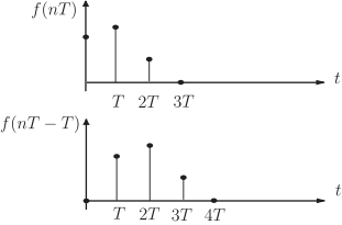
- The top graph shows a frequency function, denoted as \(f(nT)\), plotted against time, \(t\).
- At \(t = T\), the function has a high value, represented by a tall bar.
- At \(t = 2T\), the function has a moderate, non-zero value.
- At \(t = 3T\), the function has a low, non-zero value.
- The horizontal axis is marked at intervals of \(T\), \(2T\), and \(3T\).
- The bottom graph shows another frequency function, denoted as \(f(nT - T)\), plotted against time, \(t\).
- At \(t = T\), the function has a high value, represented by a tall bar.
- At \(t = 2T\), the function has a high value, represented by a tall bar.
- At \(t = 3T\), the function has a moderate, non-zero value.
- At \(t = 4T\), the function has a low, non-zero value.
- Both graphs use the time axis \(t\) as the horizontal scale.