7 Final Report
Dalip Bachu
Understanding the differences between the variance in the difficulties of recreating the resources shown in the document ‘Trigonometric ratios of an angle of any size’.
A mock up of the accessible version of ‘Trigonometric ratios of an angle of any size’ was made using the resources developed over the course of this project.
7.1 Classification of difficulty of conversion.
7.1.1 Easy:
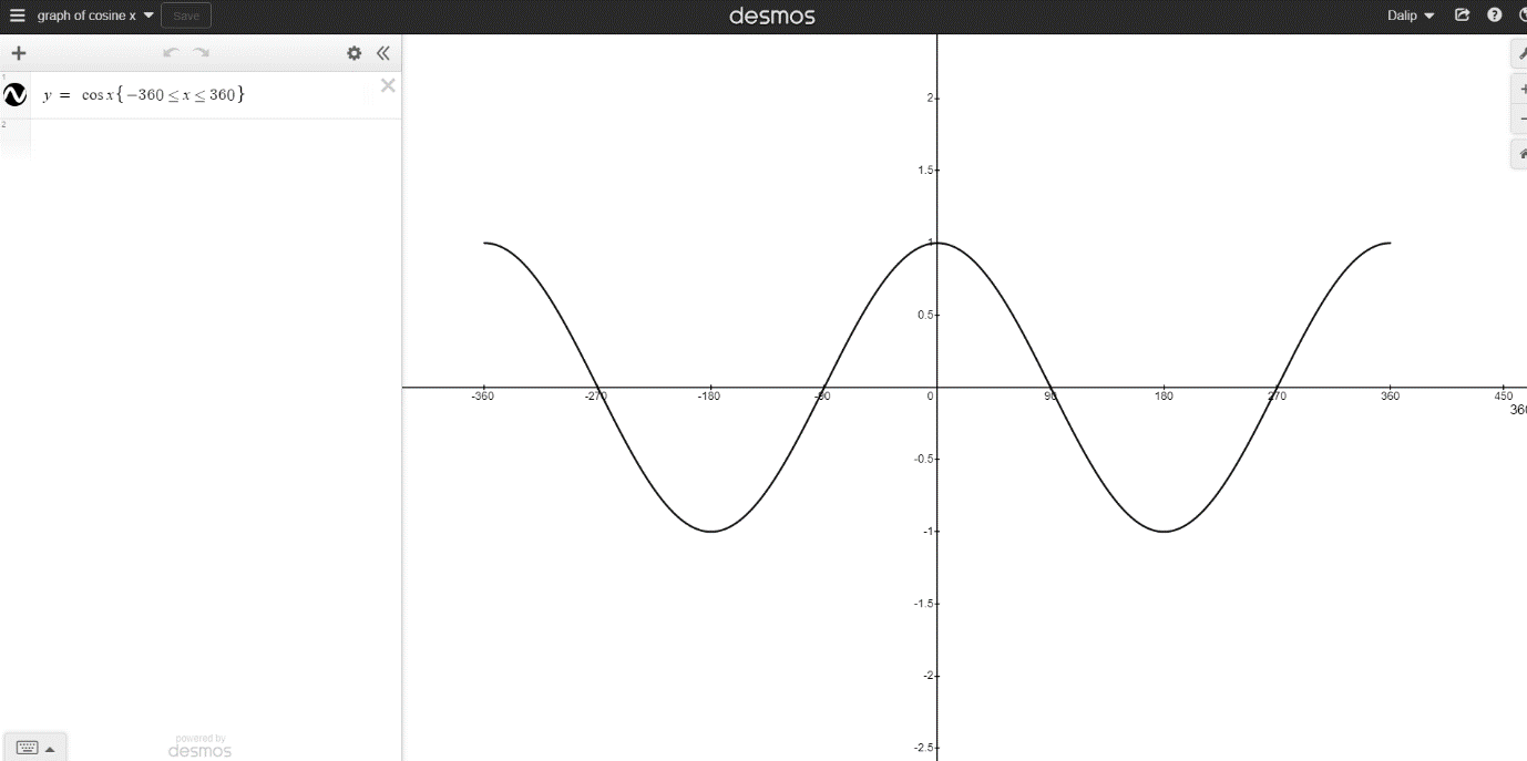
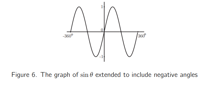 This is the original static image of the
sin graph. Recreating this within Desmos is an easy task, as Desmos is
very intuitive. It does not need to look exactly as it does in the
original resource – the main goal for it is to be accessible. Shown
below is my example resource for the recreated sin.
This is the original static image of the
sin graph. Recreating this within Desmos is an easy task, as Desmos is
very intuitive. It does not need to look exactly as it does in the
original resource – the main goal for it is to be accessible. Shown
below is my example resource for the recreated sin.

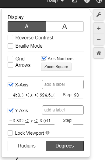
Naming the graph as “graph of sine x” is useful, as the screen reader will read it out literally as it is spelled. Having as few components as possible on the left-hand side makes it the most accessible, as there is not too much to output from the screen reader. Having a <= sign creates a less than or equal to sign, this is useful to know. Having the x axis scale in 90 is done by clicking the spanner in the top right corner and writing 90 in step. An example of how to do this is shown below.
7.1.2 Medium:
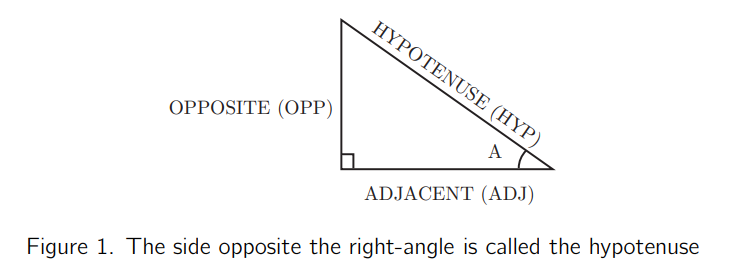
Diagram Description automatically generated
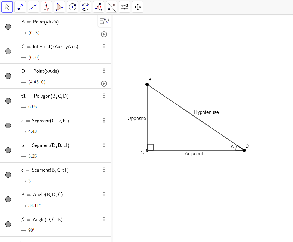 This is an example of one of the resources
that is of medium difficulty to recreate in GeoGebra. As I had no
experience using GeoGebra in the past, I first created this resource
using text to describe each of the edges, rather than using the in-built
captioning feature which is more useful for a visually impaired person.
Also, having each point on the corners visible is more accessible, as it
reads them out as well as the segments between the points. The main
difficulty I found was finding the words to describe a triangle to a
visually impaired person. https://poet.diagramcenter.org/index.html
helped, along with reading the text around the image in the page, so I
knew what to include and what has already been said.
This is an example of one of the resources
that is of medium difficulty to recreate in GeoGebra. As I had no
experience using GeoGebra in the past, I first created this resource
using text to describe each of the edges, rather than using the in-built
captioning feature which is more useful for a visually impaired person.
Also, having each point on the corners visible is more accessible, as it
reads them out as well as the segments between the points. The main
difficulty I found was finding the words to describe a triangle to a
visually impaired person. https://poet.diagramcenter.org/index.html
helped, along with reading the text around the image in the page, so I
knew what to include and what has already been said.
7.1.3 Hard:
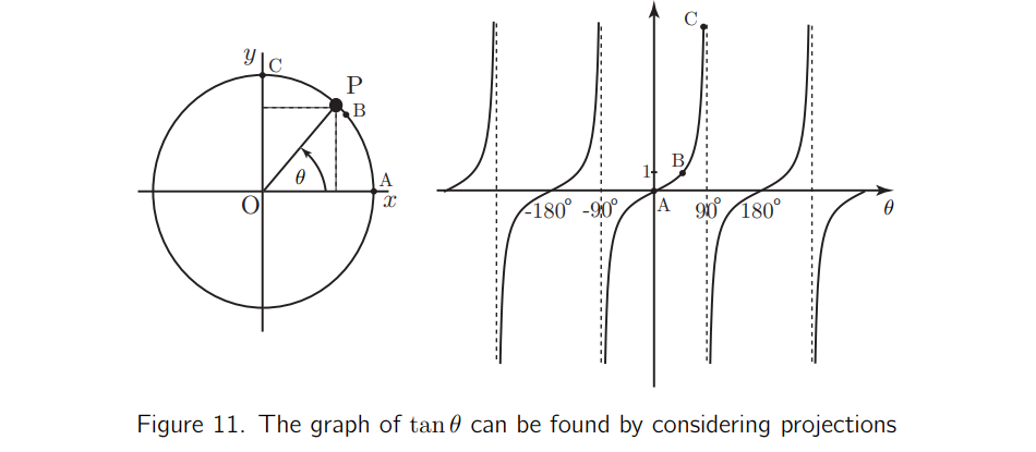
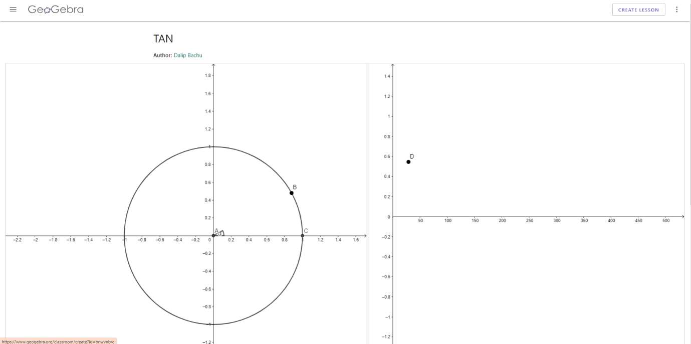
The most difficult type of resource I found to make was the dynamic images of the moving sin, cos and tan graphs. The example of how the tan graph is in the current pdf is shown below.

 My first attempt to recreate the tan graph and where it is derived from is shown below.
https://www.geogebra.org/classic/vjwfw2tr
This was not easily accessible, as there are too many components to create the graph. They would all be read out one by one. I thought there was an opportunity to suppress the outputs of some components that weren’t necessary by marking them as auxiliary objects, however the screen reader reads them from the graphics view rather than the algebra view. I also thought it would be necessary to show where the x co-ordinates come from in the tan graph.
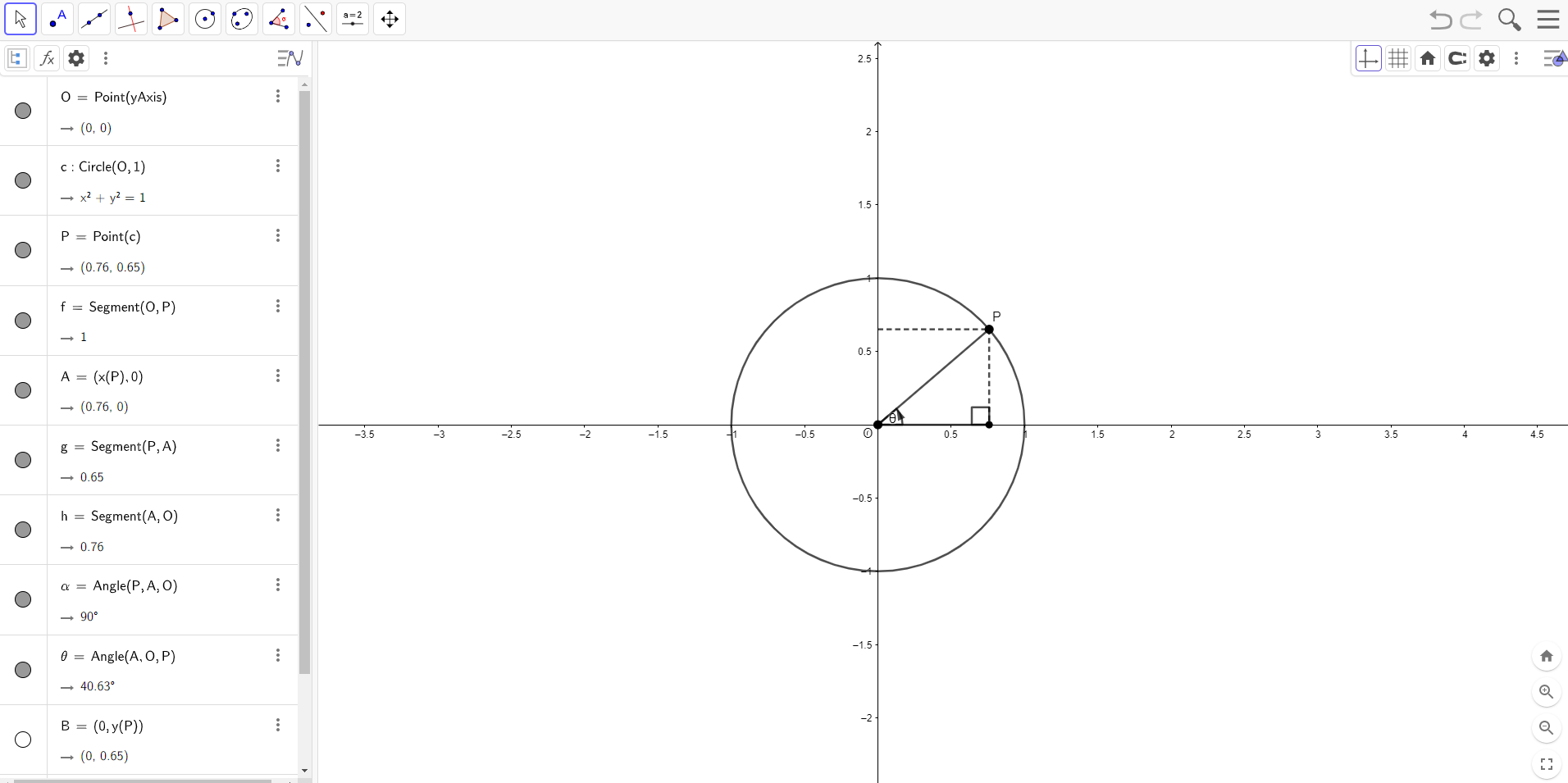
We decided that creating the simplest possible resource with the fewest number of components would be more accessible, as the screen reader reads each individual component. Also, discovered that you can use two different graphics views with one algebra view, so you can decide in which graphics view a point goes. Shown below is the tan graph.
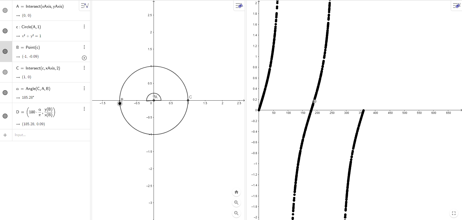
Diagram Description automatically generated
7.2 Things I wish I knew before creating the resources:
7.2.1 Top tips
Familiarise yourself with how to describe a mathematical resource before you create a resource, using https://poet.diagramcenter.org/
Take the time to understand how to use multiple graphics views in GeoGebra before jumping in to create resources.
Creating a dynamic resource in GeoGebra is significantly more difficult than creating a static image (especially if you’re using multiple graphics views).
Use the minimum number of components when creating a GeoGebra resource – the screen reader will read out every single component and there is not a way to suppress the information being read out.
Marking things as auxiliary objects does not work – they hide them from the algebra view but when navigating through the graphics views they get read out.
Use the in-built captioning features to describe an edge or a point is more accessible than creating text, as a visually impaired person will probably not be able to figure out which text is corresponding to which component.
Use the captioning to describe certain points to make them more accessible.
Use the points of an object to create an angle, as using the angle between lines feature in GeoGebra is unpredictable.
Creating the resources in a certain order is more accessible, despite it potentially not being the most logical way to create the resource.
An example of this will be shown later in the document.
It is not always necessary to create a perfect recreation of the original image – a simpler looking but more accessible resource is more important than keeping the image exact.
Read the text surrounding the image so you know what information is vital to put in the resource, and what is not necessary.
The workarounds (like creating an arrow with a vector and an arc) are not useful for a visually impaired person.
If you want to change the order components are read out in – go in construction protocol where you can move things around (be careful with dependencies).
Use
{}in Desmos to define where you want the function to start and finish.Use
<=to create the or equal to signs in Desmos.
7.2.2 Logical vs Accessible:
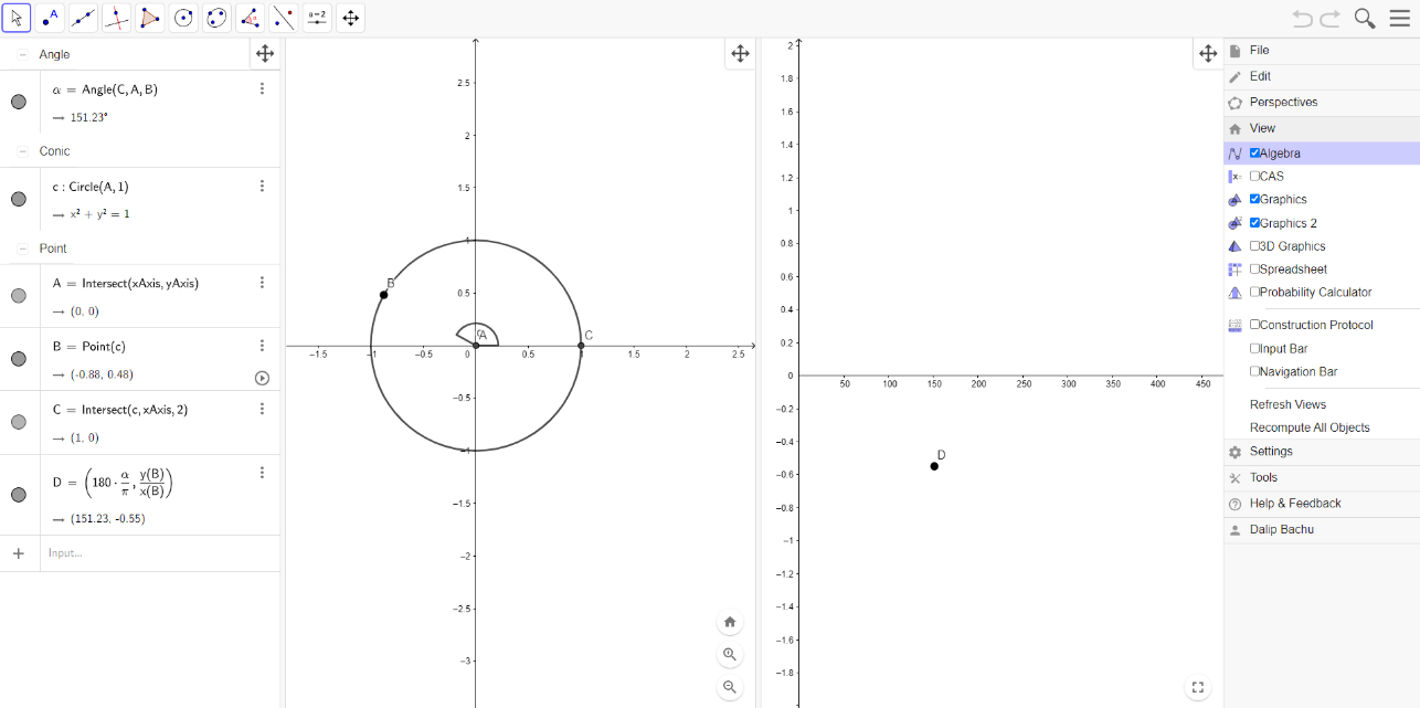
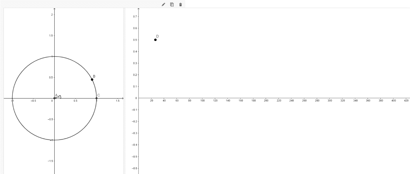
Since in geogebra the tab order is defined by the order of object creation sometimes, the most logical way to create a resource is not the most accessible way to create the resource. An example of this is shown below.
Diagram, engineering drawing Description automatically generated
Here is an example of a point P which moves around the circle C. The most logical way to create this type of resource, I found, was as follows:
Create point O
Create circle
Create point P
Create point A on the x axis
Create point B on the y axis
Create angle AOP
Create right angle OAP
Create line OA
Create line AP
Create line BP
An alternative method to create this resource is the one I used as shown in the image above:
Create point O on the origin (because of the dependencies this must be made first)
Create the circle c centred on the origin having radius 1
Create point P on the diameter of the circle
Create the line segment between points O and P – this makes it clear that the segment is between the origin and the point just created.
Create point A which uses the x value of the point P
Create segment AP which uses the point just created
Create segment AO which again uses point A
Create the angles between the segments (OAP and AOP)
Create the final point B (it is hidden here) which uses the y value of the point P
Create the final segment BP as the point B has just been created.
7.2.3 Comparing accessibilities between original and simplified tan graphs
I have created two videos of each tan graph, demonstrating how the screen reader interacts with them. For the initial Tan graph I made, the screen reader takes approximately 4:30 just to read out each component of the graph. To interact with the slider, using the screen reader, you can press the space bar for the angle to change around the origin. It attempts to read out the angle of the point while it is changing, so therefore it says “Graphics view 1” over and over until the slider is paused.
For the simplified (and more accessible tan graph) for the screen reader to interact with every component, it took 1:10. This is significantly less than the time it took for the alternative tan graph. I think this would be easier to understand for a visually impaired person, as there is a lot less unnecessary information being read out to them. For a visually impaired person to interact with the point B on this tan graph, they can use the plus and minus arrows on the keyboard and move through it in their own time. They could also see where the corresponding point D is on Graphics View 2 for wherever they place B, and notice the behaviour of the point D, when B is changed.
The simplified version of each of the Sin, Cos, and Tan graphs I found to be more accessible, as they made more logical sense to me as I was experimenting with the screen reader.
7.2.4 A perfect recreation is not necessary
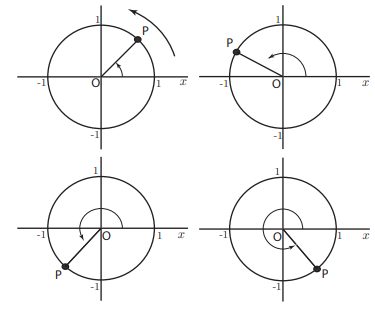
Initially, I thought it would be best to create an accessible recreation of the resources that are already made. This was because I felt that the text surrounding the objects, used to describe it, would not make sense if the resource isn’t an exact match to what it was before. This caused me to create some workarounds – which were both not necessary and not accessible. Shown below is how the original static resource was shown on the document.
Below is my first attempt to make this a dynamic resource.
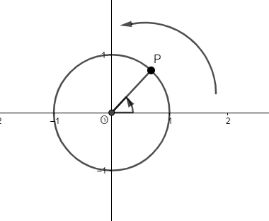
A picture containing text, lamp Description automatically generated
I created this and it became a dynamic resource, but I then tested it with a screen reader, and I discovered that it is not an accessible resource for a visually impaired person. This is because I used a workaround in order to get the large arrow around the outside of the circle. I made it by creating a circular arc around the outside and attached a very small vector to it. It is made up of two components. The screen reader reads out each component one at a time, and although the vector starts from a similar point to where the arc is, they are not connected so it would be difficult for a visually impaired person to understand that I was trying to create an arrow.
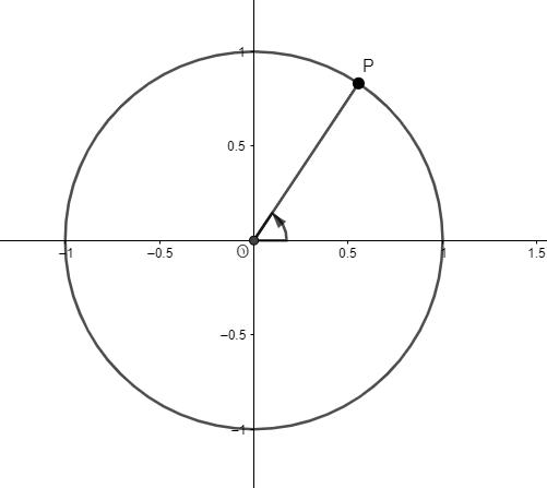
Diagram Description automatically generated
This is the final, simplified version of the image. After realising the arrow wasn’t necessary (especially because there is an arrow in the angle to show which way it is being measured) I decided to get rid of it. This makes it more accessible to a visually impaired person, as there is now less components being read out by the screen reader.
7.3 Adding Geogebra to a HTML document
7.3.1 HTML embed code:
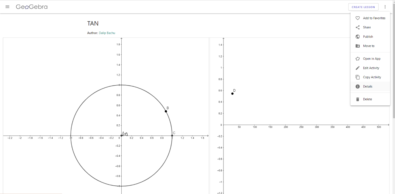
Using the links to transfer across the GeoGebra resources I created proved to be difficult when embedding them into the accessible HTML file. A way to overcome this is for the person who created the resource (me in this case) to tidy it up, by first removing the Algebra view, followed by resizing both of the graphics views by zooming in or out. Following this, save the resource into the account of the user and close it. Then, open GeoGebra’s home page and go to the resources page, followed by clicking “mine” so you can open the resource that you have just saved. Next, click the three vertical dots in the top right corner and select details. This will take you to a different page where you can click share and them embed so you can copy and paste the HTML code.
 Unselect “Algebra” shown below. This will remove
the left most column where the description of each component is
shown.
Unselect “Algebra” shown below. This will remove
the left most column where the description of each component is
shown. If necessary, adjust the zoom levels
of each of the views separately. This can be done by using the
scroll wheel or the magnifying glass buttons at the bottom right of
the views. You can also adjust the positioning of both views here by
dragging the backgrounds around. The resource should now look like
this.
If necessary, adjust the zoom levels
of each of the views separately. This can be done by using the
scroll wheel or the magnifying glass buttons at the bottom right of
the views. You can also adjust the positioning of both views here by
dragging the backgrounds around. The resource should now look like
this.Save the resource to your account and close the tab.
Go to geogebra.org and select resources.
 Select “mine” in the top bar and
select the resource to open it.
Select “mine” in the top bar and
select the resource to open it.Click the three dots in the top right corner of the page and select details
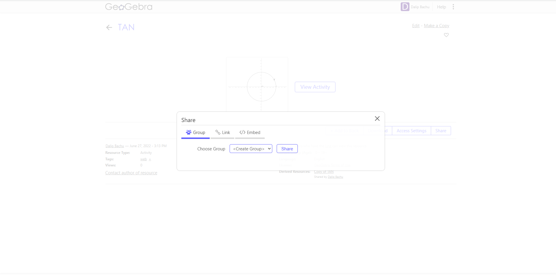
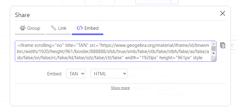
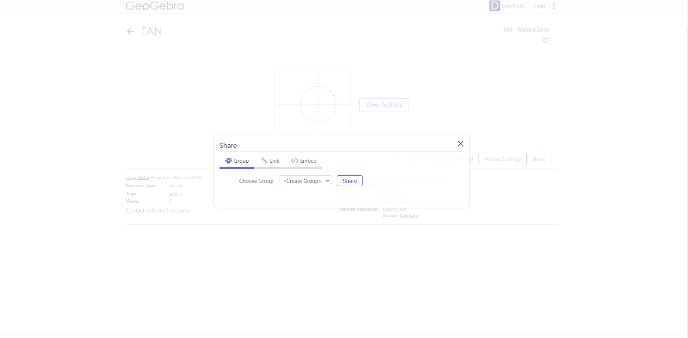
 Click “share” followed by the “Embed”
button and copy the code to paste.
Click “share” followed by the “Embed”
button and copy the code to paste.To make the applet responsive one method it to use bootstrap stylings. Remove the width=“1920px” height=“961px” and wrap it in a div with class="embed-responsive embed-responsive-16by9" so the applet can rescale so it can be used on a phone.
7.3.2 Resizing the GeoGebra file after embedding
It is likely that the GeoGebra “applets” will need resizing once you have written the code. The easiest way to do this is to resize the resources on each graphics views and then save it. The code (which will remain the same) will then access the original resource through GeoGebra to then display the most recent save of the resource.
7.3.3 Disabling pan and zoom on GeoGebra applets:
Go to geogebra.org and select “resources” on the left followed by “mine” and select the resource you wish to disable the pan and zoom feature on.
In the top right, select the three vertical dots button and select edit activity.
Then select the pencil icon at the top of the applet, as demonstrated by the picture below.
Then scroll down to advanced settings and click the box that says enable pan and zoom to unselect it.
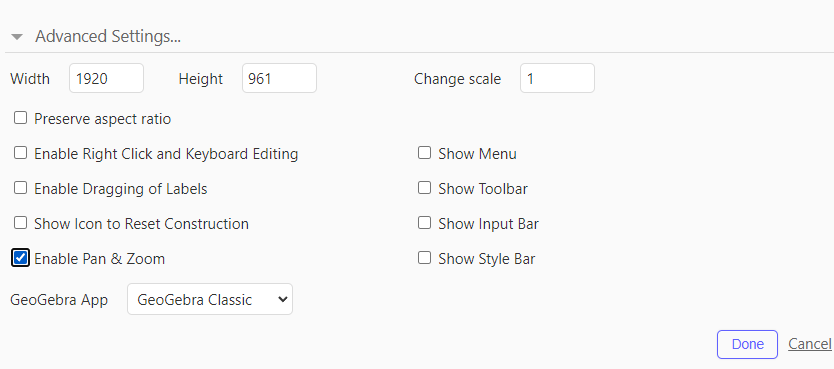 Select save changes and close.